Bubblegum Pink Color Palette: 7 Timeless Ways to Use It

Bubblegum Pink
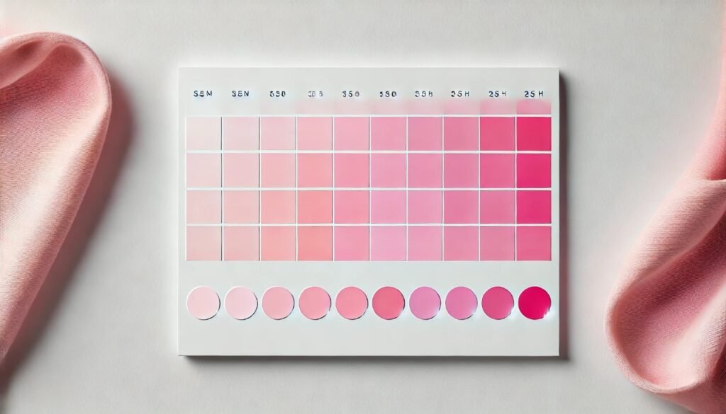
Bubblegum Pink is one of the most recognizable shades in fashion, home decor, and design. This energetic, playful hue captures the nostalgia of childhood bubblegum and pairs perfectly with pastel aesthetics. As trends shift towards bright and nostalgic color schemes, the Bubblegum Pink color palette stands out for its versatility and joyful vibe. From modern interiors to eye-catching fashion, this charming color is here to stay.
Bubblegum Pink: A Playful Nostalgic Shade
Bubblegum Pink isn’t just another pink; it offers a balance of whimsy and sophistication. This hue, typically defined as a soft, vibrant pink with blue undertones, evokes nostalgia, joy, and bold creativity. Whether it’s paired with neutral tones or vibrant contrasts, Bubblegum Pink palettes always bring energy to the space or product.
Characteristics of the Bubblegum Pink Color Palette
- Warm undertones with subtle blue or purple hints.
- Soft yet vivid finish, making it versatile for interiors and fashion.
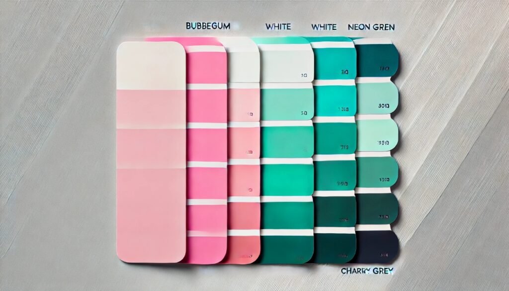
- Works well with white, grey, teal, and even neon colors.
- Often associated with childhood joy and playful aesthetics.
This palette is versatile enough to fit modern, retro, and contemporary styles. It also has a way of creating a calming effect when blended with muted or neutral colors.
How to Incorporate Bubblegum Pink Into Your Life
Choosing a color like Bubblegum Pink can seem bold, but when used correctly, it adds personality to any environment. Let’s explore some easy ways to bring this charming hue into your lifestyle.
Fashion That Pops with Pink
Bubblegum Pink has taken over fashion runways. It’s no longer reserved for little girls’ outfits—this bold hue is now a high-fashion statement.
- Outerwear: Bubblegum Pink coats or jackets provide a bright yet stylish look.
- Accessories: A handbag or scarf in this hue adds a playful pop to monochrome outfits.
- Makeup Trends: Lipsticks and blushes in this shade add a fresh, youthful appearance.
Pairing Bubblegum Pink with black or navy tones creates an elegant contrast perfect for both casual and formal settings.
Decorating Your Space with a Bubblegum Pink Color Palette
When it comes to interiors, the Bubblegum Pink color palette can work in nearly any room. It injects a sense of joy and liveliness into neutral spaces without overwhelming them.
- Living Rooms: Add accent pillows, rugs, or a throw blanket.
- Bedrooms: Use it on walls or bedding for a soft and cozy vibe.
- Home Office: Brighten the space with a Bubblegum Pink desk or chair.
For minimalist designs, small accents in this shade keep the room looking sophisticated yet cheerful.
Complementary Colors to Pair with Pink

The key to making Bubblegum Pink work lies in finding the right color combinations. Let’s explore some great choices.
- White: For a clean, minimalist feel.
- Teal: Adds a fresh, coastal vibe.
- Neon Green: A funky, playful contrast for bold designs.
- Charcoal Grey: A modern touch that balances the brightness of pink.
Using these combinations ensures the palette looks balanced and chic. You can also add metallics like silver or gold for an extra luxurious touch.
Pink in Graphic and Web Design
This playful shade isn’t limited to physical spaces—it’s also perfect for graphic design projects. From websites to packaging, Bubblegum Pink makes a lasting impression.
- Call-to-action buttons in this shade stand out on websites.
- Product packaging with Bubblegum Pink appeals to younger demographics.
- Logos and branding elements become instantly memorable with this color.
Designers love it because it blends well with modern trends while retaining a sense of fun.
The Psychology Behind Bubblegum Pink
Pink, as a color, often conveys warmth and love. However, Bubblegum Pink has a more youthful and energetic edge. Psychologically, it can evoke feelings of happiness, enthusiasm, and nostalgia. That’s why many brands use it to create positive emotional connections with their audience.
A Bubblegum Pink Palette for Every Season
You might think this color is only appropriate for spring or summer, but that’s far from the truth. With the right styling, you can make Bubblegum Pink a year-round color.
- Spring: Pair with lavender and mint for a soft palette.
- Summer: Combine with neon shades for a tropical look.
- Fall: Add deeper hues like burgundy for a warm contrast.
- Winter: Use with metallics like silver or champagne gold for festive decor.
Why Bubblegum Pink Is Trending
Bubblegum Pink has seen a resurgence thanks to fashion movements like “Barbiecore” and interior trends focused on pastel aesthetics. Social media platforms like Pinterest and Instagram are flooded with Bubblegum Pink decor ideas, making it one of the most pinned color schemes in 2024.
This trend isn’t just about nostalgia—it reflects a collective desire for playfulness and positivity in uncertain times.
Key Takeaways for Using Bubblegum Pink
When working with a Bubblegum Pink palette, balance is everything. Use these tips to keep your space or outfit looking fresh, and not overwhelming:
- Start small—introduce Bubblegum Pink through accents or accessories.
- Mix with neutrals like white or grey to tone down the brightness.
- Experiment with textures—think velvet, satin, or matte finishes.
- Use sparingly in professional environments to avoid looking too playful.
These suggestions make it easier to integrate this cheerful hue into everyday life.
FAQs
How can I tone down Bubblegum Pink in decor?
- Pair it with muted or neutral colors like beige, white, or grey to soften its impact.
Is Bubblegum Pink suitable for professional spaces?
- Yes, when used sparingly. Try small accents like office supplies or a feature wall.
What colors go well with Bubblegum Pink in fashion?
- It pairs beautifully with black, white, navy, and metallics for a chic look.
Can I use Bubblegum Pink for branding?
- Absolutely! It’s an eye-catching color that appeals to youthful and creative audiences.
Is Bubblegum Pink only for feminine designs?
- Not at all. When combined with darker shades, it can take on a more gender-neutral tone.
How can I use Bubblegum Pink without overwhelming a space?
- Incorporate it through accents like throw pillows, vases, or artwork.
Conclusion
The Bubblegum Pink color palette offers a playful yet elegant way to incorporate vibrant hues into your life. Whether in fashion, interiors, or graphic design, this versatile shade has proven its worth across different styles and trends. Bubblegum Pink balances nostalgia with modernity, creating spaces and outfits that feel joyful and fresh. With its timeless charm and endless design possibilities, there’s no doubt that Bubblegum Pink will continue to influence creative industries for years to come.


