fefefe Hex Color Code: Mastering Its Usage and Impact

fefefe
The hex color code fefefe is a versatile and elegant shade often used in web and graphic design. Designers value it for its almost pure white tone, with a subtle hint of light gray, creating a softer, less stark appearance compared to the pure white #ffffff. This unique hex code offers depth while maintaining a clean and minimalist aesthetic. Let’s explore how fefefe works in different contexts, its properties, and how it can enhance your next design project.
What is the fefefe Hex Color Code?
The fefefe hex color is a six-character code that represents a shade of white with a hint of gray. It follows the hexadecimal color representation widely used in web design, digital artwork, and programming. This particular shade, while subtle, offers a refined option for interfaces and backgrounds, adding elegance without straining the eyes.
- Hexadecimal Code: fefefe
- RGB Value: (254, 254, 254)
- CMYK Value: (0%, 0%, 0%, 0.78%)
Why Use fefefe in Design?
fefefe holds a special place in the design community due to its unique properties:
- Soft and Inviting Aesthetic: Unlike pure white (#ffffff), fefefe offers a slightly subdued tone that feels more welcoming and less harsh on screens.
- Readability and Clarity: Its subtle gray undertone helps differentiate text and elements while maintaining clarity.
- Easy on the Eyes: In low-light settings, fefefe reduces eye strain compared to pure white.
- Versatility: It pairs well with a variety of colors, from bold hues to muted tones.
How to Implement fefefe in CSS
To use fefefe in your CSS code, you simply apply it as a background or text color. Here’s a quick example:
Creating a fefefe-based Color Scheme
When building a color scheme with fefefe, consider pairing it with complementary and contrasting colors to achieve balance and depth. Here are some suggested combinations:
- Primary Color: #fefefe
- Complementary Color: #1a1a1a (a dark gray)
- Accent Color: #ff5733 (bright orange)
- Neutral Color: #cccccc (light gray)
Tips for Building a fefefe Color Palette
- Contrast Control: Use contrasting colors like deep blues, blacks, or dark grays for text or UI elements to ensure readability.
- Minimalist Design: Embrace whitespace and simplicity, making fefefe the focus in minimalist layouts.
- Warm Tones: Pair fefefe with warm tones for a cozy, approachable design.
Visual Examples of fefefe in Action
Let’s explore how fefefe can elevate your design by examining its practical applications.
Image 1

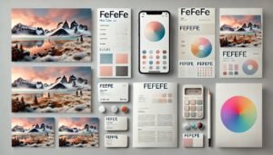
This web design showcases fefefe as the main background color, creating a clean, modern, and visually comfortable space. Elements with darker contrasting colors stand out well.
Image 2

The fefefe hex color plays a pivotal role in minimalist design layouts, providing subtle contrast against icons and text.
Accessibility Considerations with fefefe
Designing with accessibility in mind is crucial to ensure your content is inclusive for all users. Although fefefe is soft on the eyes, it may not always offer enough contrast for people with visual impairments when used as a text or element color. Consider these accessibility guidelines:
- Contrast Ratio: Maintain a contrast ratio of at least 4.5:1 between text and background colors.
- Testing Tools: Use tools like the WebAIM Contrast Checker to verify accessibility compliance.
- Readable Fonts: Choose bold, clear fonts that contrast effectively with fefefe.
Accessibility Best Practices
- Dark Mode Compatibility: Test how fefefe looks in dark mode settings.
- Button Styling: Ensure buttons using fefefe backgrounds have contrasting borders or shadows for visibility.
Applications of fefefe in Branding
fefefe has unique advantages when it comes to branding:
- Sophistication: Its soft tone exudes elegance, making it ideal for luxury or high-end brands.
- Professionalism: fefefe lends a professional, polished appearance to presentations and documents.
- Calm and Neutral Appeal: It’s a perfect match for calming, neutral brand palettes in wellness, skincare, and tech.
Examples of Brand Identity with fefefe
- Luxury Retail Websites: Using fefefe as a background creates an upscale shopping experience.
- Professional Documents: The soft white hue offers a refined backdrop for reports, business cards, and presentations.
Best Practices for fefefe in Web Design
To maximize the impact of fefefe in web design, follow these tips:
- Use it for Backgrounds: Ideal for creating clean, elegant, and distraction-free user interfaces.
- Pair it with Bold Colors: Contrast fefefe with vibrant colors for call-to-action buttons or headlines.
- Combine with Textures: Add subtle textures over fefefe to break monotony without losing its minimalist vibe.
Common Mistakes to Avoid
- Low Contrast Text: Text in light gray over fefefe may be difficult to read.
- Overuse of White Space: While clean design is great, too much white space can make the page feel sparse.
fefefe in Print vs. Digital
The way colors are rendered in print and digital media often differs. With fefefe, consider these differences:
- Digital Mediums: It maintains its soft, elegant look on screens, reducing glare.
- Print Mediums: Ensure print colors are calibrated, as fefefe may appear lighter or darker depending on paper quality.
FAQs
What does the fefefe hex color code mean?
The hex color fefefe represents an off-white shade with a hint of gray. It’s widely used in web and graphic design due to its sophisticated and subtle aesthetic.
How can I use fefefe for accessibility in design?
Ensure a high contrast ratio when using fefefe as a background color, especially for text, buttons, and other key elements.
Is fefefe suitable for dark mode interfaces?
Yes, fefefe works well in dark mode when paired with complementary dark shades to provide enough contrast and readability.
What colors pair well with fefefe?
Colors like dark gray, navy blue, and bright accent colors such as orange pair beautifully with fefefe, creating a balanced and visually appealing color scheme.
Does fefefe work for branding and luxury designs?
Absolutely! fefefe offers a sophisticated touch, making it ideal for luxury branding, professional presentations, and minimalistic layouts.
Can fefefe be printed accurately?
Yes, but calibration is important. The soft gray undertone may appear different on printed media, so preview colors on physical samples.
Conclusion
The fefefe hex color code offers designers a refined, elegant, and versatile option to create clean, welcoming, and user-friendly designs. Its unique off-white tone, accessibility potential, and compatibility with modern design trends make it a favorite among professionals. Whether you’re crafting a website, branding material, or a digital interface, fefefe delivers understated sophistication.


